Working with school performance data
Apr 14, 2026
Why any of this matters
My day job is training computing teachers at the University of Roehampton. Part of what that means, beyond the classroom practice, is tracking what actually happens to computing as a subject once it is taught in school: how many schools offer a GCSE, how many pupils take it, and what grades they get. These are straightforward questions, but the moment you start making comparisons - across school types, across deprivation bands, across gender - things get interesting in a way that carries real policy weight.
Much of the richest data on individual pupils is held by the state and processed under a public interest basis that most academic researchers cannot access. That data lives at the ONS and is, rightly, tightly regulated. What we can access is the data aggregated to school level, published annually by the DfE. It is, it turns out, more than enough to ask some pointed questions.
The basic measures: Attainment 8 and Progress 8
The headline measure in school league tables is Attainment 8. Think of it as a pupil’s best eight GCSEs, except that English and maths are each counted twice - because the system treats those subjects as the most important - giving a maximum possible score of 90. The national average sat at 46 in the most recent series, which works out to an average GCSE grade of around 4.6.
The more interesting measure is Progress 8. Rather than asking how well pupils did, it asks how much progress they made: it compares a pupil’s GCSE results against what would be predicted from their Key Stage 2 SATs scores. A school with a Progress 8 score of zero means its pupils made exactly the progress you would expect. Positive means they made more; negative means less. The problem for the 2025 cohort is that their Year 6 SATs were cancelled in 2020 because of the pandemic, so Progress 8 cannot be calculated for this year’s school leavers. We are left working with Attainment 8 alone, which is a cruder instrument.
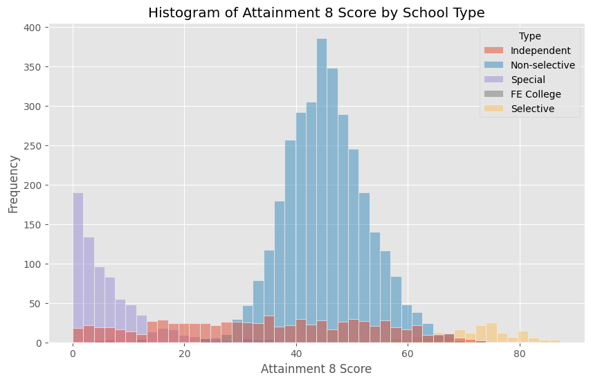
The histogram reveals something immediately: the distribution is not normal. There is a cluster of schools at the very high end whose scores reflect a very different kind of institution - the selective grammar schools, where entrance is determined by an exam, and where even accounting for prior attainment, the scores pull sharply away from the mainstream. Strip those out and the distribution of non-selective schools tells a much cleaner story.
Deprivation and attainment
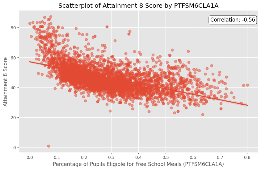
The scatter plot is uncomfortable reading. Across almost every school in the country, as the proportion of pupils eligible for free school meals rises, Attainment 8 falls. The relationship is strong and, fitting an OLS regression model with free school meals percentage, IDACI band, and school type as predictors, we can account for around 54% of the variance in school-level Attainment 8 scores. The coefficient on free school meals is striking: moving from a school with no FSM pupils to one where all pupils qualify for free meals is associated with a drop of around 27 points on the Attainment 8 scale - a huge effect.
IDACI (the Income Deprivation Affecting Children Index, which ranks postcodes by deprivation) turns out, perhaps surprisingly, to be a less significant predictor than free school meals once both are in the model. This is consistent with the idea that it is pupil-level poverty within a school, not simply the postcode of the school, that carries the greater predictive weight.
Selective schools, by contrast, add roughly 20 points to the Attainment 8 prediction. This is not evidence that selective schools make pupils smarter. It reflects, at least in part, the fact that families who can afford private tuition are more likely to get their children through the eleven-plus - and their children would likely have done well regardless.
The attainment gap within schools
The DfE also publishes separate Attainment 8 figures for pupils who do and do not receive free school meals, at the level of individual schools. This allows a comparison that is, if anything, more sobering than the school-to-school picture.
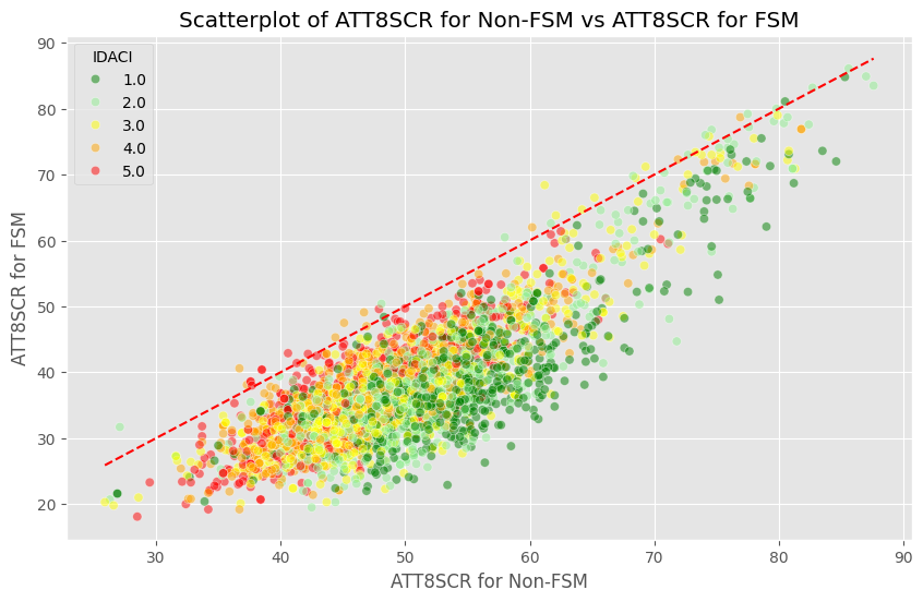
In almost every school in England, the non-FSM pupils outperform their FSM peers. Almost every school sits below the line of equality. Some schools sit well below it - a gap of 25 or more Attainment 8 points between the two groups within the same institution. There is no obvious pattern by school type or deprivation band that explains this away; the gap is pervasive.
The pupil premium - additional funding attached to each disadvantaged pupil - was introduced precisely to address this gap. There is evidence it has helped, but the scatter plot is a reminder of how much distance remains.
Gender
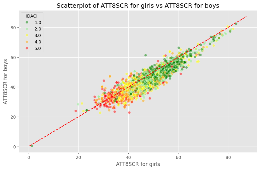
Girls outperform boys at GCSE, consistently and across almost every school type. The data bears this out at a national level, and a scatter plot of schools’ Attainment 8 for girls against boys reveals the same pattern within schools that the FSM analysis showed for deprivation.
What makes this particularly interesting is that when it comes to GCSE Computer Science specifically, girls who sit the exam also tend to get better grades than their male counterparts - even though far fewer girls choose to take it. This raises an important question: is the gender gap in computing a gap in attainment, or a gap in participation? The data suggests strongly that it is the latter.
Geography
We have postcodes for every school, and with some geocoding work it is possible to convert those into latitude and longitude and plot performance on a map.
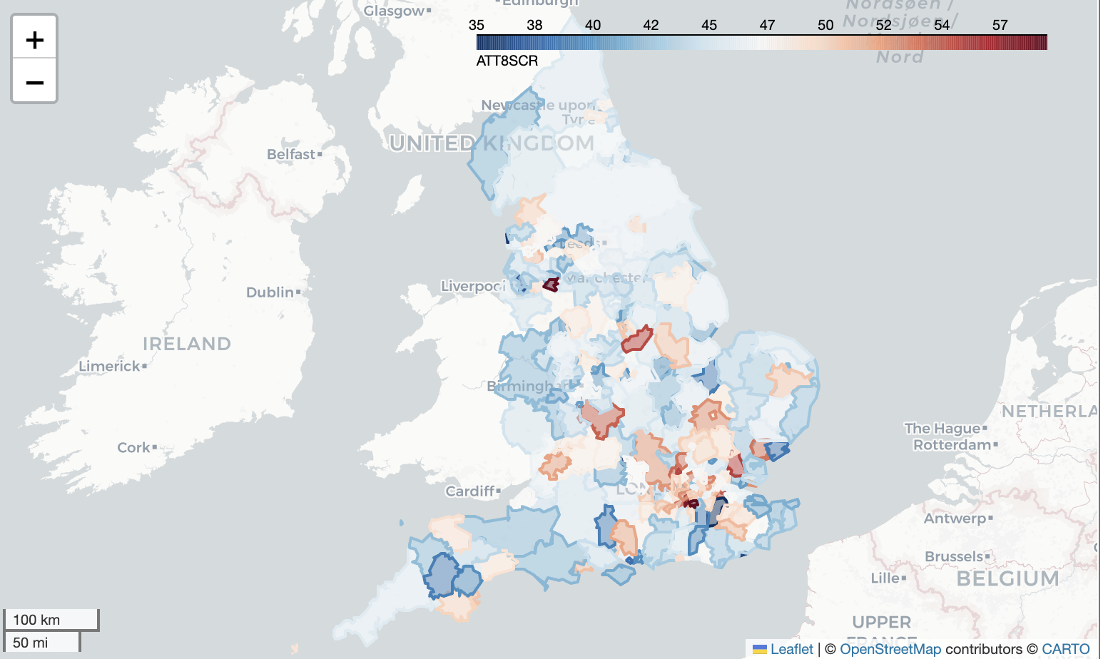
London comes out near the top of regional performance, with a pupil-weighted average Attainment 8 of around 51.4 - well above the national figure. The North East sits at the bottom. Part of this is surely a reflection of wealth: to live in London, households need to be relatively well paid. But there is a reasonable case that London schools are also, genuinely, better - perhaps because teacher labour markets are deeper, or because the EAL effect (discussed below) is stronger there.
A note of caution is worth mentioning here. Averaging Attainment 8 by simply taking the mean across all schools treats a school of 200 pupils the same as one of 2,000. The right approach is a weighted average, taking each school’s contribution in proportion to its Year 11 cohort size. In practice this makes only a modest difference to the regional rankings, but it matters for smaller local authorities with unusual institutions dragging the mean.
EAL: the exception to expect
One of the more striking findings across the data is what happens when you look at pupils for whom English is an additional language. The expected story - that EAL is a marker of disadvantage that would be associated with lower attainment - is not what the data shows. EAL pupils, on average, do as well as or better than their peers at GCSE. And schools with higher proportions of EAL pupils are, in the regression model, more likely to offer GCSE Computer Science, not less.
There are plausible explanations. EAL support in English schools is well-resourced and has a reasonably strong evidence base. There may also be a selection effect: families who have moved to England and have school-age children are often, though not always, in a position of relative economic stability compared to the circumstances they came from. None of this should be taken as reason for complacency, but it is a reminder that the relationships between pupil characteristics and outcomes are not all in the same direction.
Computing specifically: offer, uptake, and equity
Turning to GCSE Computer Science (shortly to become GCSE Computing following the Becky Francis curriculum review), the picture nationally is that around 75% of secondary schools offer the qualification. In grammar schools that figure rises to around 98%. In independent schools it falls to roughly 50%, though this partly reflects the fact that independent schools frequently sit alternative qualifications.
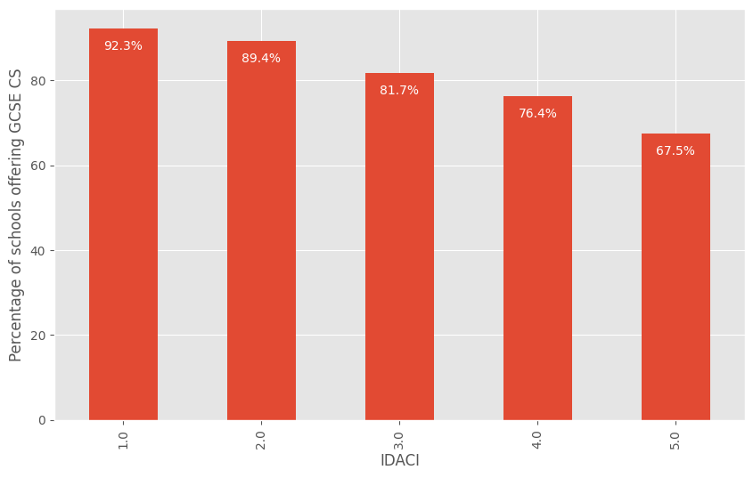
The IDACI breakdown is the sharpest of the equity findings. In the wealthiest fifth of postcodes (IDACI Band 1), around 92% of schools offer GCSE Computer Science. In the least wealthy fifth (IDACI Band 5), that drops to roughly two in three. Children in more deprived areas are less likely - through no choice of their own - to attend a school that even gives them the option of studying the subject at GCSE.
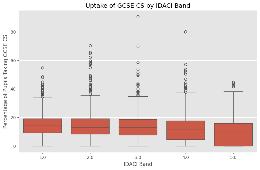
Among those schools that do offer the subject, uptake runs at around 13% of all pupils nationally. In grammar schools the figure is 28%. Girls’ schools sit slightly above average for mixed schools - possibly because computing is not so readily coded as a boys’ subject when there are no boys in the room. Boys’ schools, unsurprisingly given the overall gender pattern, see much higher uptake.
The logistic regression tells a clear story: higher FSM percentage and higher SEN percentage are both associated with a lower probability that a school offers the qualification. Higher EAL percentage is associated with a higher probability. These are all statistically significant effects.
What the data doesn’t tell us
It is worth being clear about what school-level data cannot do. Because we are working with aggregated figures - averages per school, not individual records - we cannot follow a pupil’s journey from primary to secondary, cannot properly disentangle the contributions of the school from the contributions of the cohort it serves, and cannot identify which specific interventions within a school make a difference. The Progress 8 measure exists precisely to address part of this problem, but its absence this year is a reminder of how dependent good analysis is on data that is consistently collected.
There is also the fundamental question of what we are measuring when we measure GCSE grades. Attainment 8 captures performance in public examinations taken at 16. It does not capture curiosity, resilience, creativity, or the ability to work with uncertainty - the things that degree apprentices spend their working lives developing. The data we have is the data we have, and it is valuable, but it would be a mistake to confuse the map for the territory.
Where this leads
The reason I track computing education specifically is that the picture is not good enough, and it is not improving at the pace it should. Thirteen per cent of pupils taking GCSE Computer Science is too few, given the centrality of computing to contemporary life. The gap between the most and least deprived schools in even being offered the subject is a genuine equity problem. And the gender gap in participation - boys taking the subject at roughly twice the rate of girls - persists even as the overall numbers inch upward year on year.
The reforms following the Francis Review - broadening the qualification from Computer Science to Computing, with a wider content scope intended to attract a more diverse cohort - are an attempt to address some of this. Whether they succeed is exactly the kind of question that school-level data, analysed patiently and without over-interpreting noisy signals, is well placed to help answer.
Based on my guest lecture to Ada College degree apprentices, 14 April 2026. Jupyter notebook online via Colab.
Share